Although all humans that we know about are capable of producing accurate sketches of localities and regions with which they are familiar, cartography (the craft of map making as we know it today) had its beginnings in 16th-century Europe, and its subsequent development is related to the expansion of Europeans to all parts of the globe. From the beginning, there have been two problems with maps: the technical one of how to depict on a twodimensional, flat surface a three-dimensional spherical object, and the cultural one of whose worldview they reflect. In fact, the two issues are inseparable, for the particular projection one uses inevitably makes a statement about how one views one’s own people and their place in the world. Indeed, maps often shape our perception of reality as much as they reflect it.
In cartography, a projection refers to the system of intersecting lines (of longitude and latitude) by which part or all of the globe is represented on a flat surface. There are more than a hundred different projections in use today, ranging from polar perspectives to interrupted “butterflies” to rectangles to heart shapes. Each projection causes distortion in size, shape, or distance in some way or another. A map that correctly shows the shape of a land-mass will of necessity misrepresent the size. A map that is accurate along the equator will be deceptive at the poles.
Perhaps no projection has had more influence on the way we see the world than that of Gerhardus Mercator, who devised his map in 1569 as a navigational aid for mariners. So well suited was Mercator’s map for this purpose that it continues to be used for navigational charts today. At the same time, the Mercator projection became a standard for depicting landmasses, something for which it was never intended. Although an accurate navigational tool, the Mercator projection greatly exaggerates the size of landmasses in higher latitudes, giving about two thirds of the map’s surface to the northern hemisphere. Thus the lands occupied by Europeans and European descendants appear far larger than those of other people. For example, North America (19 million square kilometers) appears almost twice the size of Africa (30 million square kilometers), while Europe
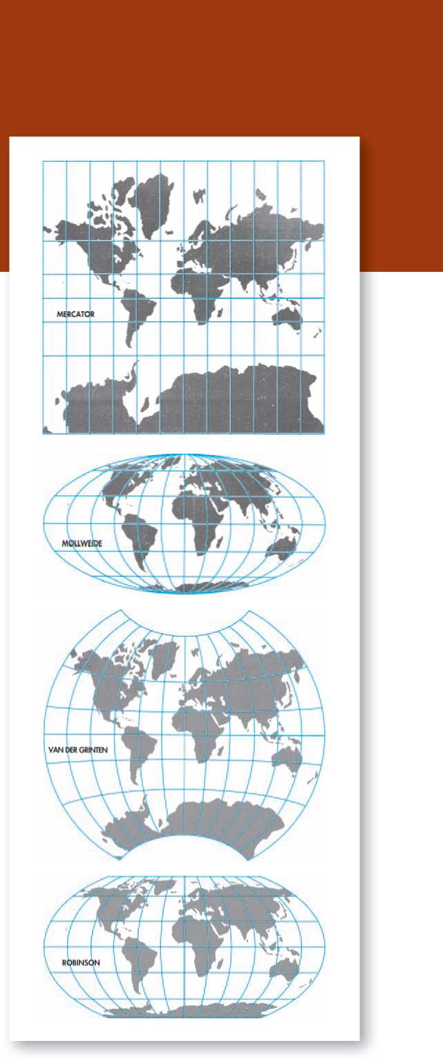
Is shown as equal in size to South America, which actually has nearly twice the landmass of Europe.
A map developed in 1805 by Karl B. Mollweide was one of the earlier equal-area projections of the world. Equal-area projections portray landmasses in correct relative size, but, as a result, distort the shape of continents more than other projections. They most often compress and warp lands in the higher latitudes and vertically stretch landmasses close to the equator. Other equal-area projections include the Lambert Cylindrical Equal-Area Projection (1772), the Hammer Equal-Area Projection (1892), and the Eckert Equal-Area Projection (1906).
The Van der Grinten Projection (1904) was a compromise aimed at minimizing both the distortions of size in the Mercator and the distortion of shape in equal-area maps such as the Mollweide. Although an improvement, the lands of the northern hemisphere are still emphasized at the expense of the southern. For example, in the Van der Grinten, the Commonwealth of Independent States (the former Soviet Union) and Canada are shown at more than twice their relative size.
The Robinson Projection, which was adopted by the National Geographic Society in 1988 to replace the Van der Grinten, is one of the best compromises to date between the distortions of size and shape. Although an improvement over the Van der Grinten, the Robinson Projection still depicts lands in the northern latitudes as proportionally larger at the same time that it depicts lands in the lower latitudes (representing most Third World nations) as proportionally smaller. Like European maps before it, the Robinson Projection places Europe at the center of the map with the Atlantic Ocean and the Americas to the left, emphasizing the cultural connection between Europe and North America, while neglecting the geographic closeness of northwestern North America to northeastern Asia.
The following pages show four maps that each convey quite different cultural messages. Included among them is the Peters Projection, an equal-area map that has been adopted as the official map of UNESCO (the United Nations Educational, Scientific, and Cultural Organization), and a map made in Japan, showing us how the world looks from the other side.
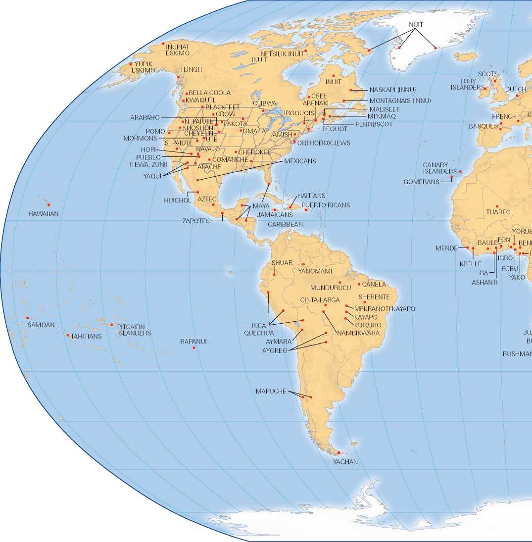
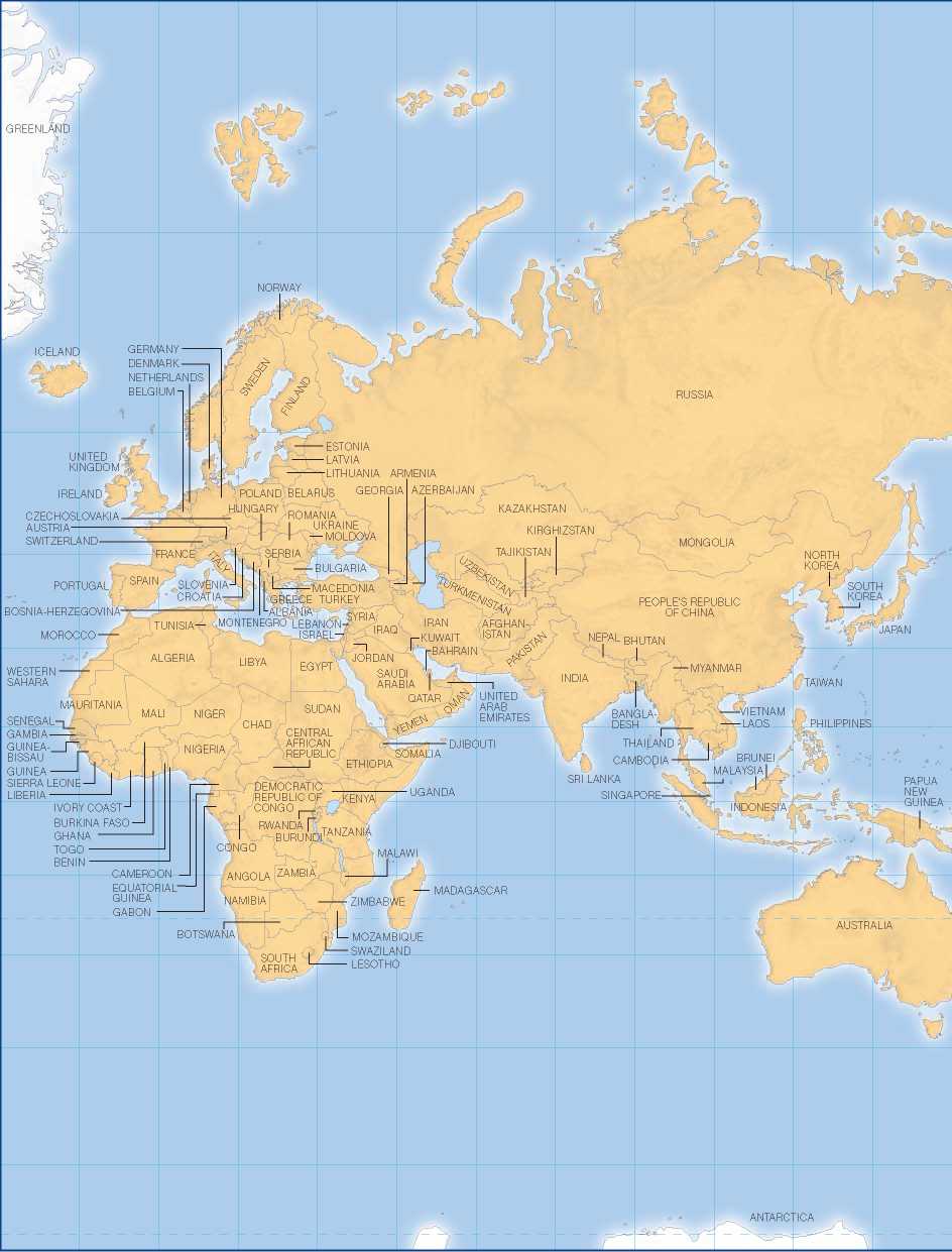
The map below is based on the Robinson Projection, which is used today by the National Geographic Society and Rand McNally. Although the Robinson Projection distorts the relative size of landmasses, it does so much less than most other projections. Still, it places Europe at the center of the map. This particular view of the world has been used to identify the location of many of the cultures discussed in this text.
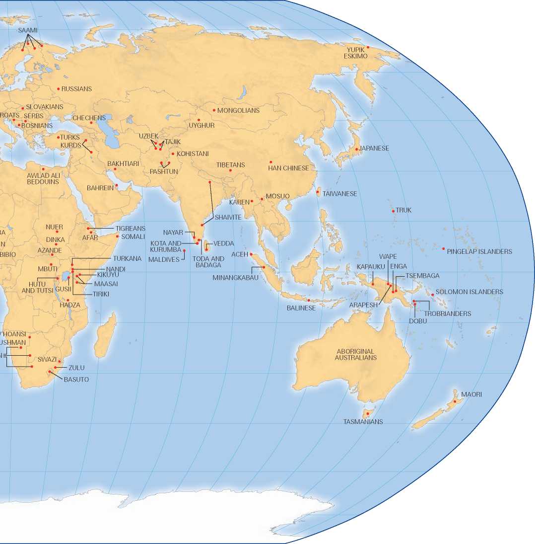
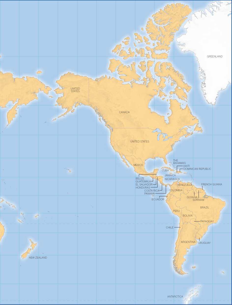
The map below is based on the Peters Projection, which has been adopted as the official map of UNESCO. While it distorts the shape of continents (countries near the equator are vertically elongated by a ratio of 2 to 1), the Peters Projection
Does show all continents according to their correct relative size. Though Europe is still at the center, it is not shown as larger and more extensive than the Third World.
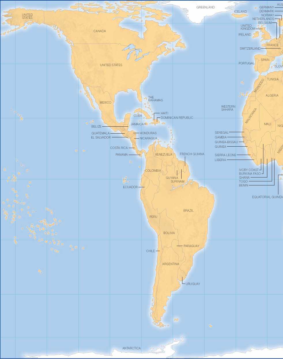
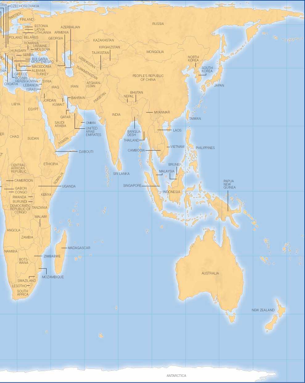
Not all maps place Europe at the center of the world, as this Japanese map illustrates. Besides reflecting the importance the Japanese attach to themselves in the world, this map
Has the virtue of showing the geographic proximity of North America to Asia, a fact easily overlooked when maps place Europe at their center.
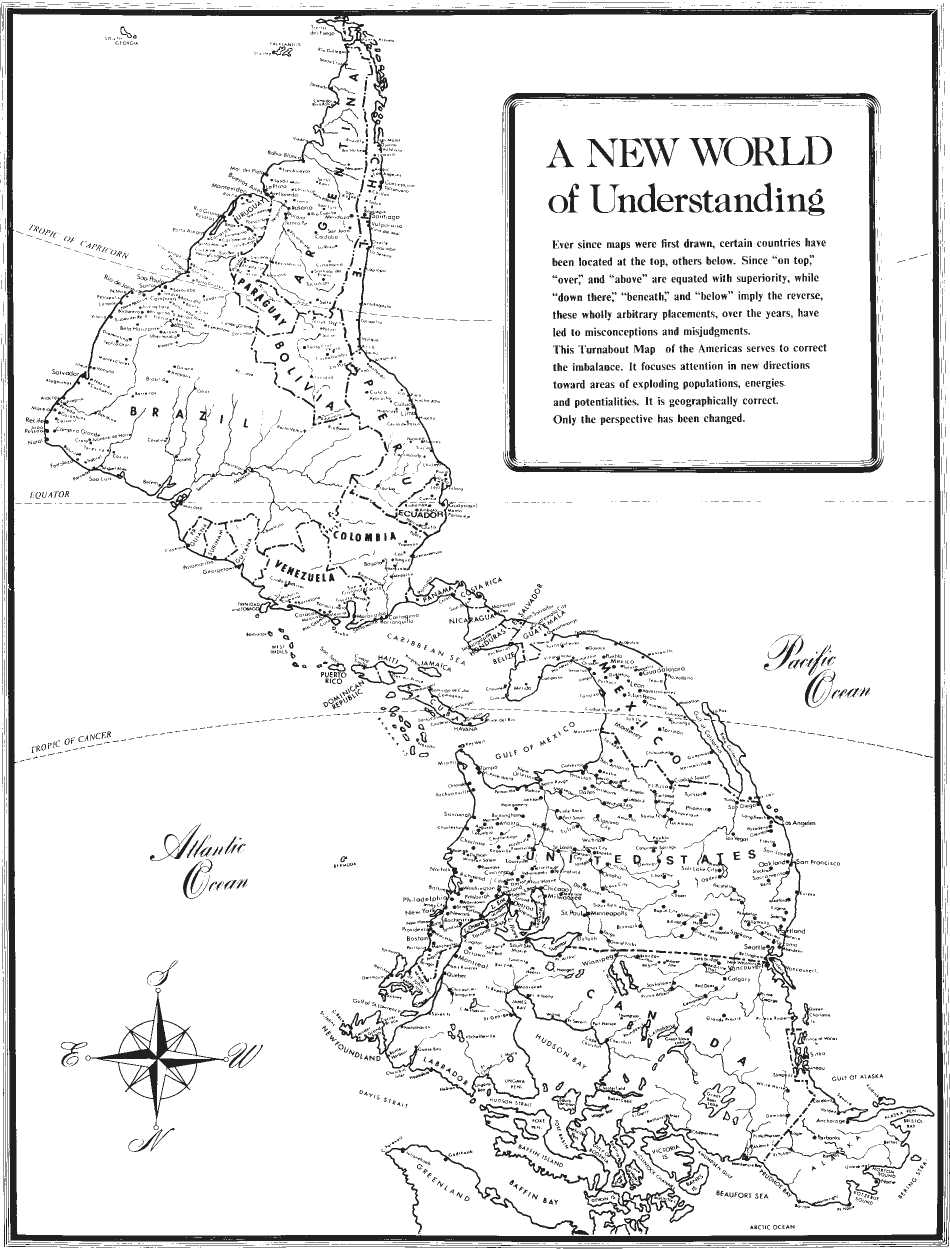
The way maps may reflect (and influence) our thinking is exemplified by the Turnabout Map, which places the South Pole at the top and the North Pole at the bottom. Words and phrases such as “on top,” “over,” and “above" tend to be equated by some people with superiority. Turning things upside-down may cause us to rethink the way North Americans regard themselves in relation to the people of Central America. © 1982 by Jesse Levine Turnabout Map™—Dist. by Laguna Sales, Inc., 7040 Via Valverde, San Jose, CA 95135


 World History


