Many Americans, particularly college students, and among college students, in particular those who have joined the Occupy Wall Street movement, worry that even though the economy is growing, they will not be able to share in that growth because the distribution of income is becoming less equal: the rich are hogging all the gains. Stories about the fabulous incomes of Wall Street Investment bankers and speculators seem to confirm the impression that the rich are getting richer and the poor, poorer. The Occupy movement has made famous the difference between the 1 percent who have captured all the gains from economic growth and the 99 percent who got nothing. What do the numbers show?
Table 30.5 shows the distribution of household incomes from 1947 through 2009. This table is common way of presenting information about income inequality. If every household had the same income, then the poorest 20 percent of families would have the same share of total income as everyone else—20 percent. But of course the share of the poorest 20 percent is much less than the share of the richest 20 percent. Clearly, the broad contours of family incomes have not changed radically over the postwar period. Just as clearly, however, the distribution has become less equal since the 1980s. The share of the lowest fifth fell from 4.3 percent in 1980 to 3.4 percent in 2009. In other words, the share of the poorest fifth fell almost 25 percent [(4.3 - 3.4)/((4.3 + 3.4)/2) = 0.23]. While the share of the poorest households was falling, the slice of the pie going to the richest 20 percent of Americans rose from 43.7 percent in 1980 to 50.3 percent in 2009, an increase of 14 percent.
TABLE 30.5 DISTRIBUTION OF HOUSEHOLD INCOMES BY QUINTILE (IN PERCENT)
|
LOWEST |
SECOND |
THIRD |
FOURTH |
HIGHEST | |
|
YEAR |
FIFTH |
FIFTH |
FIFTH |
FIFTH |
FIFTH |
|
1947 |
3.5% |
10.6% |
16.7% |
23.6% |
45.6% |
|
1950 |
3.1 |
10.5 |
17.3 |
24.1 |
45.0 |
|
1960 |
3.2 |
10.6 |
17.6 |
24.7 |
44.0 |
|
1970 |
4.1 |
10.8 |
17.4 |
24.5 |
43.3 |
|
1980 |
4.3 |
10.3 |
16.9 |
24.7 |
43.7 |
|
1990 |
3.9 |
9.6 |
15.9 |
24.0 |
46.6 |
|
2000 |
3.6 |
8.9 |
14.8 |
23.0 |
49.8 |
|
2005 |
3.4 |
8.6 |
14.6 |
23.0 |
50.4 |
|
2006 |
3.4 |
8.6 |
14.5 |
22.9 |
50.5 |
|
2007 |
3.4 |
8.7 |
14.8 |
23.4 |
49.7 |
|
2008 |
3.4 |
8.6 |
14.7 |
23.3 |
50.0 |
|
2009 |
3.4 |
8.6 |
14.6 |
23.2 |
50.3 |
Source: 1947-1990: Historical Statistics of the United States, 2006, Series Be2-Be6; 2000-2009: Statistical Abstract of the United States, 2012, Table 694.
FIGURE 30.4
Percent of Total Income Going to the Top 1 percent of the Population, 1913-2010
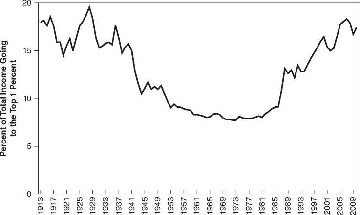
Note: Since 1980 the share going to the top 1 percent has risen dramatically.
Source: Alvaredo, Facundo, Anthony B. Atkinson, Thomas Piketty and Emmanuel Saez, The World Top Incomes Database, Http://g-mond. parisschoolofeconomics. eu/topincomes, 10/11/2012.
Further evidence on the distribution of income is shown in Figure 30.4 which shows the percentage of total income going to the top 1 percent of Americans from 1913 to 2010. There is a distinct U-shaped pattern. The share of the top 1 percent was generally 15 percent or higher until World War II when it fell abruptly to about 10 percent. That decrease seems to have been the product of full employment, the absence of immigration which helped people at the bottom of the income distribution, and a combination of government policies and social pressures that limited wage increases at the top of the distribution (Goldin and Margo 1992). The share of income then fell gradually until the mid-1970s when it began to rise. As this is written, the share of the richest 1 percent has returned to levels last seen in the 1920s.
Although the evidence shown in Table 30.5 and Figure 30.4 of growing inequality is clear, the reasons for it are complex and not completely understood (Atkinson, Piketty, and Saez 2011). One factor making for greater inequality was changes in the top tax brackets. Tax rates on high incomes were lowered significantly during the administrations of Ronald Reagan and George W. Bush. This meant not only that wealthy Americans could keep a larger fraction of the income earned in a particular year, but also that their savings would compound at a faster rate.
Almost all observers agree that another major reason for the widening of the gap between rich and poor has been the enormous increase in the demand for highly trained personnel—in medicine, computers, finance, and similar fields—compared with the smaller increase in demand for personnel with only a high school education. Policy mistakes probably compounded this problem. In the 1970s, fear of oversupply led to cutbacks in government support for the education of highly skilled professionals. The number of medical degrees conferred, for example, rose at a rate of only 0.1 percent per year from 1985 to 2009, far below the rate of population increase, although if one includes other medical professionals—dentists, optometrists, and so on—the increase in the number of degrees conferred was sufficient to match the rate of growth of population. We will discuss the race between education and technology in more detail later.
“Superstar theory” explains the growth of income inequality in certain areas of the economy. Improvements in communication and transportation mean that a superstar— an opera singer, novelist, baseball player, and so forth—can reach a much larger audience than was true in the past. Their incomes then soar relative to slightly less able competitors. Why pay to see the local symphony, to take an extreme example, when you can listen to one of the world’s best orchestras on your iPod?
Changes in the role of women in the economy may also have played a role. Two-earner families, in which both family members are highly paid professionals, once a rarity, have become commonplace. These families were well placed to take advantage of changes in demand for highly skilled workers and low tax rates for retaining and accumulating wealth. Table 30.6 shows how different types of families have fared since 1950. Between 1980, when income growth slowed, and 2009, median real incomes of “two-earner” households rose 0.88 percent per year, while median real incomes for households in which the wife was not in the paid labor force rose only 0.04 percent per year. These results were mirrored by the median real incomes for households in which no husband or wife was present. Median real income for a household headed by a woman with no husband present rose 0.63 percent per year; median real income for household headed by a man with no wife present actually fell 0.28 percent per year.
Financial booms and busts also played a role in determining the growth of high incomes. Note that in Figure 30.4, the share of income going to the top 1 percent rose dramatically from 15 percent to almost 20 percent during the boom from 1923 to 1928 and then fell back to 15 percent during the contraction from 1929 to 1931, the start of the Great Depression. This pattern was repeated, although on a smaller scale, during the boom from 2003 to 2007 and the contraction from 2008 to 2010. This pattern is not surprising. The rich are likely to benefit more (relatively) from booms on asset markets and to suffer more from crashes than the average person because more of their income is derived from financial assets.
Finally, some thoughtful observers have argued that a change in “social norms” may have played a role in growing inequality. Salary differentials between chief executives and factory workers, or even between superstar and average professors, that might have raised eyebrows in the 1950s would probably be considered normal or even fair today.
What to do about inequality is also a complex issue. Taxation of people with high incomes is an obvious partial remedy. But this policy will not automatically produce help for people who are chronically poor and who year in and year out are unable to consume more than poverty-level incomes. These individuals and families constitute perhaps 4 percent of all households; they are what William Julius Wilson (1987) has
TABLE 30.6 MEDIAN REAL FAMILY INCOME BY TYPE OF FAMILY (IN 2006 DOLLARS) ]
|
FAMILIES |
1950 |
1980 |
1990 |
2000 |
2006 |
2009 |
ANNUAL GROWTH RATE 1980-2009 |
|
Married couple families |
$24,646 |
$53,919 |
$ 59,661 |
$69,194 |
$ 69,404 |
$67,307 |
0.76% |
|
Wife in the paid labor force |
27,923 |
62,619 |
69,953 |
81,062 |
82,788 |
80,765 |
0.88 |
|
Wife not in the paid labor force |
23,709 |
44,198 |
45,260 |
46,812 |
45,757 |
44,775 |
0.04 |
|
Male householder, no wife |
22,279 |
42,307 |
43,437 |
44,171 |
41,844 |
38,998 |
-0.28 |
|
Present | |||||||
|
Female householder, no |
13,746 |
23,314 |
25,321 |
30,109 |
28,829 |
27,974 |
0.63 |
|
Husband present | |||||||
|
All families |
22,493 |
48,976 |
52,869 |
59,398 |
58,407 |
56,464 |
0.49 |
Source: Statistical Abstract of the United States, 2012, Table 699.
Referred to as “the truly disadvantaged.” The capacity of the United States to help these people achieve a decent material standard of living is without question, but the will to do so is another matter. The mobility of people moving from one income class to another must also be taken into account. Families in the lowest category may be there for temporary reasons: a proprietor of a small business who had a bad year or an executive of a large corporation who was laid off and is temporarily experiencing a low income. Highly skilled and ambitious immigrants may enter the lowest category but steadily work their way up.
 World History